Caldas Total Insights
Your go-to source for the latest news and informative articles.
Typography Secrets That Make Your Website Pop
Unlock the hidden typography secrets that will transform your website and grab attention! Elevate your design game today!
5 Typography Tricks to Enhance Your Website's Visual Appeal
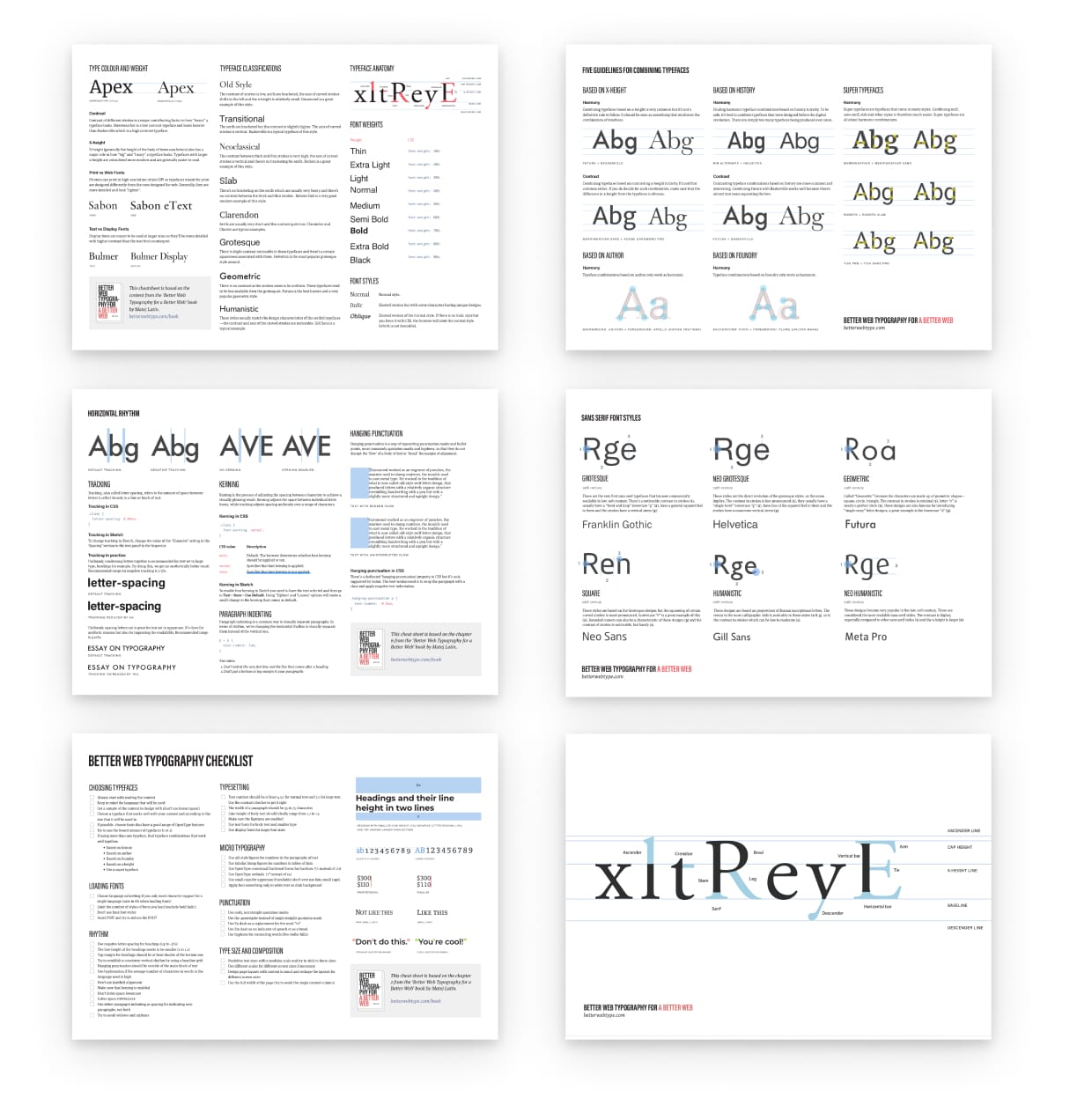
Typography plays a crucial role in the visual appeal of your website. To start enhancing your website, consider using a limited color palette for your fonts. This approach not only maintains consistency throughout your site but also makes it easier for visitors to focus on your content without distractions. Another trick is to pair fonts wisely. Traditionally, it's recommended to use one font for headings and another for body text, ensuring that they complement each other. A common pairing can involve a bold, sans-serif font for headings and a clean serif font for body text, creating a harmonious balance that catches the eye.
Additionally, pay attention to line spacing and letter spacing. Adequate spacing increases readability and gives your typography some breathing room. Using contrast to your advantage is another effective trick; choose a font color that stands out against your background for the best readability. Lastly, incorporating responsive typography ensures that your text looks great on devices of all sizes; implementing viewport width units for font sizes can significantly enhance user experience. By applying these typography tricks, you can significantly elevate your website's visual appeal.

How to Choose the Perfect Fonts for Your Brand
Choosing the perfect fonts for your brand is crucial, as fonts play a significant role in conveying your brand's personality and values. Start by understanding the different categories of fonts – serif, sans-serif, script, and display. Each category has its unique characteristics; for instance, serif fonts often evoke a sense of tradition and reliability, while sans-serif fonts are seen as modern and clean. Once you identify the personality of your brand, select fonts that align with this image to create consistency across all your branding materials.
Next, consider the readability and versatility of the fonts you choose. A great font should be not only visually appealing but also easy to read in various sizes and formats. As you experiment with different typefaces, create a font pairing that complements your primary font with a secondary option for headlines or emphasis. Aim for a maximum of two or three fonts to maintain visual harmony. Test your chosen fonts in real scenarios, like on your website or marketing materials, to ensure they communicate your brand effectively and resonate with your target audience.
The Impact of Typography on User Experience: What You Need to Know
Typography plays a crucial role in shaping user experience (UX) on websites and digital platforms. The choice of font, size, spacing, and color can significantly influence how content is perceived and understood. For instance, using a readable font style in an appropriate size can enhance readability and make it easier for users to consume information. Conversely, poor typography choices, such as overly decorative fonts or insufficient contrast, can lead to frustration and a high bounce rate. Therefore, paying attention to typography is essential for creating a positive UX.
Moreover, typography contributes to the overall aesthetic appeal of a design. A well-chosen typography not only aids in guiding users through the content but also helps establish branding and tone. Consistency across headings, body text, and calls-to-action ensures a cohesive look and feel. To achieve optimal results, consider the following tips:
- Stick to a maximum of three different fonts to maintain harmony.
- Use varying weights and sizes to create a clear hierarchy.
- Pay attention to line height and letter spacing for improved legibility.