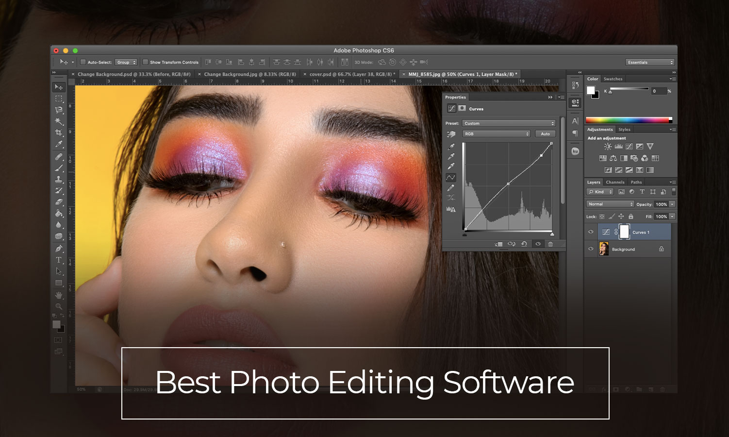
Top 5 Editing Techniques to Make Your Photos Pop
Editing your photos can significantly enhance their impact, making them stand out in a crowded digital landscape. Here are the Top 5 Editing Techniques to make your photos pop and capture your audience's attention:
- Adjust Brightness and Contrast: Fine-tuning the brightness and contrast of your images can make a world of difference. Increasing the contrast helps emphasize the details, making your subject matter pop. For a deeper understanding of this technique, check out Photography Life.
- Saturation and Vibrance Enhancements: Boosting the saturation can bring life to dull colors, while the vibrance tool selectively enhances muted colors. This balance brings energy to your photographs without making them look unnatural—learn more about these adjustments at Dummies.
3. Sharpening Your Images: Applying sharpening can enhance the details of your photos. It's essential to find the right balance; too much sharpening can create a harsh look. For tips on optimal sharpening techniques, visit Digital Photo Mentor.
4. Using Filters and Presets: Filters and presets can dramatically change the look and feel of your images with just a few clicks. They're particularly useful for maintaining a consistent style across your portfolio. Explore some of the top available filters at Photo Workout.
5. Cropping for Composition: A well-composed photograph draws the viewer's eye. By cropping effectively, you can eliminate distractions and focus attention on the core subject. For further insights on composition and cropping, refer to The Art of Photography.
The Ultimate Guide to Color Grading for Stunning Visuals
The Ultimate Guide to Color Grading is essential for anyone looking to enhance their visual storytelling. Color grading is the process of adjusting the color and tonal values of your footage to create specific moods, evoke emotions, and give your visuals a professional polish. By mastering color grading techniques, such as color wheels and lut (lookup tables), you can transform ordinary visuals into awe-inspiring pieces. To get started, familiarize yourself with popular color grading software like Adobe Premiere Pro, DaVinci Resolve, or Filmora that offer powerful tools for beginners and professionals alike.
In this guide, we will explore key concepts in color theory, the significance of color contrasts, and the emotional impact of different hues. For instance, colors like blue might evoke calmness and serenity, while reds and oranges can stimulate excitement and passion. Understanding these principles will help you make informed decisions during the grading process. Additionally, check out resources such as Color Grading Central for tutorials, tips, and community support. Embrace the art of color grading, and watch your creative projects come to life with stunning visuals!
How to Turn Boring Images into Eye-Catching Art Using Editing Tools
In today's visually-driven world, boring images can significantly undermine the impact of your content. Luckily, transforming these dull visuals into eye-catching art is easier than you might think, thanks to various editing tools. Start by exploring software like Adobe Photoshop or Canva, which offer a multitude of features to enhance your images. For instance, you can adjust the color balance, add filters, and incorporate graphics or text overlays. By experimenting with these tools, you can easily make a once-boring image pop with vibrant colors and dynamic elements.
Once you've selected your tool, consider utilizing the following techniques to bring your images to life:
- Adjust Brightness and Contrast: Tweaking these settings can make colors stand out more acutely.
- Add Filters: Filters can dramatically change the mood of an image and provide a cohesive look.
- Incorporate Text: Typography can add context and intrigue, drawing viewers in with a compelling message.